What Is The Best Colour For A Button Or A Call-To-Action
No matter what you are told, the evidence shows that it impossible to prove that anyone colour performs better or worse for an audience. As quoted by Mary Fernandez. “There are just too many variables, and too much conflicting evidence to come to any universal conclusion.”
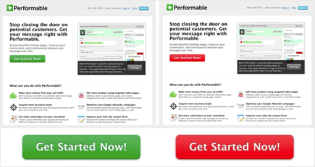
There is, in essence, no perfect colour. If you look at the image below which button would you click on?
On this page, the red button got clicked to most. As counter-intuitive as that sounds, the reason red button converted better than the green button was that green was the dominant colour on the page. Thus, the red button created more contrast. And there lies the secret – contrast.
Creating Contrast In Call To Actions
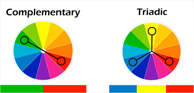
Complementary colours give the most contrast. These are colours that are opposite to your dominant colour on the colour wheel. Here is a link to the Adobe Colour wheel.
Another high-contrast colour is a triadic colour. These are colours that are a third of the way around the colour wheel from your dominant colour.
Alternative Colours For Buttons
Did someone say Orange or Yellow? Amazon’s entire site is splurged with the yellow and orange. With the amount of resources available to them it must work!!


")
