From Awareness to Allocation: 5 Email Templates for Every Stage of the Investor Journey
Today’s investor journey is a sprawling digital path. Various platform junctions act as entry points and tollbooths for data handover, and email has a starring role within this marketing cycle from engagement to conversion. The format still has enduring appeal with those that consume financial content and those that produce it – why so?
For one, it’s extremely personal. It’s a direct communication from a fund tailored to its end user, often a result of their intentional subscription to email communications. It’s also non-invasive and can be assessed whenever an investor feels like it.
For the fund marketers themselves, email allows them to play with the brand’s visual identity and tone of voice in creative ways, or to convey a lot of information in a slick package that’s effective in turning interest into action. When templates are perfected, they remain consistent footsoldiers in upping AuM.
Therefore a toolbox of swap–content-in, swap-content-out examples should be a requirement for all firms to re-utilise their most engaging outreach multiple times – for event signposts, company news and product updates, customer success stories, video roundups etc. There’s really no end to what emails can bring to a subscriber base spread all over the world.
From grasping an investor’s initial awareness to rewarding their loyalty over time, here’s a guide to five templates no progressive campaigns can be without.
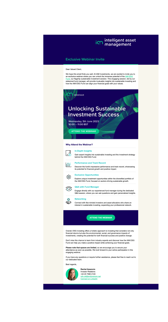
Calls for Webinar Registrations
A well-compiled invitation is ideal for both a prospective newcomer and an existing trusted investor. For the former, it’s the perfect way to extend an educational seminar that can help them explore new fund opportunities, themes and strategies, ‘straight from the horse’s mouth’ of your knowledgeable portfolio managers and stakeholders. For the latter, you could target those that’ve snooped around a different fund page or content piece they’re not already invested in to build on that interest.
A ‘cordial invite’ should live up to its name as it does here – to dress a template with a friendly face and helping-hand spin on complex financial topics – as well as identifying straight away what the event will focus on and why investors can greatly benefit from signing up.
3 Core Design Components
The Copy: A Subject Line with ‘Unlock’ only needs one clear, actionable word to evoke progression and problem-solving, while the actual event being ‘Exclusive’ or ‘Limited’ is persuasive in helping a prospect feel they’ve been thoughtfully included.
Clear Buttons: With brand-aware colours that are bold and offset against the background, it becomes far more clickable for the email’s direct purpose: to gain registrations. Its second use further down grants another bite of the cherry after a reader has learned the five crucial takeaways they’ll receive.
Promoted Connections: The email is far more personal when it’s been carefully pieced together by the picture Investor Relations personnel, while the template allows for follow-ups by offering 1-to-1 routes for direct emailing or LinkedIn messaging.
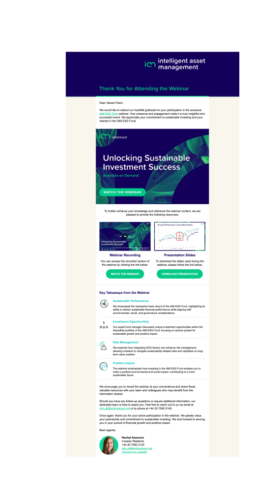
Online Event Follow-Ups
Beyond granting those that turned up to the webinar any-time access to the materials presented, this template also works to catch anyone that missed the event, but would still be interested in what’s on offer. Everyone comes away with a helpful hand-delivered resource, so this nurturing email subtly shows how all sign-ups are rewarded while promoting the fund manager’s expertise, or perhaps any related or upcoming webinars too.
3 Core Design Components
Lead Magnet Capture: Not only are the ‘watch the webinar’ or ‘download presentation’ call-to-actions (CTA) a striking, brand-building green, but the PDF document and ‘playback’ overlays are very tempting to click on and further an online journey (and for the fund to slyly gain data through a download).
Familiar Imagery: The characteristic hero image here has been reused from its preceding pre-event invitation. That repurposing solidifies its ties to the original webinar. Users will remember singing up to it, and trust who it’s from.
Scrollable Format: While offering the ‘key benefits’ front and centre, all the following links become visible as-and-when an investor wishes to scroll further down. It’s clean and formulated correctly to drive action on top of pushing the housed content.
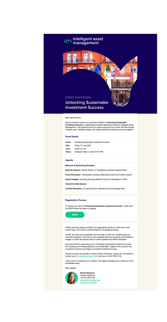
Offline Event Extended Invites
The in-person event is still alive and kicking! Online webinars are fantastic to effectively reach all investors around the globe, but personal nurturing may still be the go-to for investors that want to take their online research further. A personal handshake to get a deal over the line still means a lot, and this template works outstandly to forge closer bonds between a financial firm and its prospective investors by highlighting the exclusivity of the meeting through sleek imagery and user experience (UX) details.
3 Core Design Components
User-Friendly Language: It really is as simple as utilising everyday language such as ‘Join Us’ to evoke that feeling of human connection, while targeting the messaging toward a ‘Valued Client’ bumps up the idea of the networking opportunity being very much set up with them in mind.
User-Friendly Layout: Registrants don’t want to have to search high and low for the key dates, times and agendas; here they’re laid out in a way that’s unmistakable, uncluttered and informative. It does not need to delve too much beyond those details – the true experience will come from attending. Leave them wanting more!
A Singled-Out CTA: Block-based components are ample to grant each section its own importance. Here, they draw attention to the kindly RSVP that breaks up the bulleted and long-form text, and invites as many sign-ups as possible by emphasising the fast-selling nature of the event.
Fund Performance Updates
Not all fund marketing email content should stress performance. However, with the investor onboard and their money allocated, it becomes crucial to be transparent about how their holdings perform. This template does a brilliant job of juggling commentary, personal viewpoints and historical data all without feeling bloated, and successfully conveys the story of how a fund is faring and the investors’ involvement with that in a visually appealing way.
3 Core Design Components
Leading With the News: Having a differentiated font draws the eye to a short summary that sets the tone for the content to come; a snapshot that the investor will expect to see as quickly as possible after opening.
Mixed Content: The linear, scrollable format works well here. Graphs slot neatly within the text-based narrative for a varied feel, and with recognisable colour choices and digestible tables that are not overtly interactive and distracting. This lets investors dip into aspects of the story and the data as they see fit, as to what they find most useful.
Personalisation Priorities: The portfolio manager’s picture, title and their transcribed pull-out quotes make the message feel like the investor has a professional on their side at all times, through deliberate yet subtle style variations.
Announcing Industry Recognition
The key for turning an award announcement into a nurturing opportunity is by stressing the investor base’s involvement. It’s through continuing relationships that fund performance and sector recognition has culminated in both the company and its customer growing together to achieve great things.
Bragging is never ideal, so this template instead focuses short-and-sweet messaging on ways to up trust for a fund. This is done through labelled Morningstar ratings that speak for themselves, and boosts brand equity, especially so with this email format being highly shareable to an investors’ friends or colleagues with related financial goals.
3 Core Design Components
Subject Lines: ‘Fund Award Announcement’ is not completely on-the-nose, suggesting positive news without being too showy, and followed up by focusing on what the mentioned Award means as a modest promotional tool.
Exciting Animations: Adding a little zip and vibrancy to the icons is really effective to add a celebratory mood, with upward arrows and the spinning world here reflective of the community success achieved between fund and investor base.
Additional Fund Pushes: Promoting industry recognitions may pull an investor to discover more in the range. Just a quick URL link to a fund page guides the next steps of the digital experience without any need for over-the-top UX design, and can be left to the email’s end to not come across salesy.
Personalise to Power Ahead
Not only is ‘there an app for that’ – there’s always an email that can be fruitful for performance promotion, demand generation, brand recognition, and converting prospects. It just takes the most memorable, highly tailored templates to ensure a fund’s frequent comms are not left in the inbox malaise, instead frequently engaged with to nurture any stage of the buyer journey.
These examples make for a great 5 email jump-off points, covering various use cases, looks and feels and brand psychology know-how to hook investors and, ultimately, grow AuM in a way that’s automated and simple for the busy fund marketer.